

1)Jay-Z (The Blueprint 3) 09.11.09;
- Main features; large artist name at the top, large album logo features across the majority of the magazine page, below the image there is the album name and then larger underneath the date it is due for release alongside the record company and website.
- The colour scheme is limited to mainly whites/greys/black, however there are three stripes of red along the centre of the large image, the only other place this red is seen is in the record companies name at the bottom. This red is quite ironic as the album is called The ‘blue’print 3. The red gives connotations of anger, blood, love and passion, which can relate back to what Jay-Z may be trying to portray through his music.
- The two largest written texts on this magazine advertisement are the artist name ‘Jay-Z’ along the top and the date of release ‘09.11.09’ at the bottom. These both appear to be in a bolder font than the album name and are a lot larger than the record company and website both along the bottom.
- The main image on this advertisement is what appears to be a large pile/construction of instruments and music based equipment. This relates back to the fact that a lot of work has gone into this album and there are more modern things like keyboards alongside more retro musical equipment such as a gramophone; this could be saying that although Jay-Z makes more modern music he is still influenced by older music and respects this.'


2) Noah And The Whale ‘The First days Of Spring’;
- I like the layout of this magazine advert for Noah and the Whale, the fact that all of the text is along the top where the background is quite plain and then the subject of the photo (the band) is along the bottom makes it more interesting and pulls the advert together. The fact the whole background is a photograph and there is no colour block section for writing is something i wish to emmulate in my own magazine advert.
- This advert has all of the font in the same black colour, however a lot of it is in different fonts and sizes to make it appear different. The title of the album is along the top in the largest writing and then the band name is below in a slightly smaller writing, in a plain font and it is also written in capital letters, this creates a much bolder piece of text.
- This advert only has one 'expert opinion' on it, with it's one quote and four star rating, this is probably the best from a bunch they had but they wanted to use one which would appeal to their target audience more and one which was one of the more positive ones.
The date of release is the third largest text on the piece and each of these pieces of text are seperated by smaller pieces which make the text flow together when you read it aloud.
- The bottom line shows a logo for the record company, this is conventional of most magazine advertisements as they want to advertise theirself as a label on their artists work. This image is also in black so nothing stands out in the advertisement.
- The image features the band and shows the main lead of the band in sharp focus whilst the others blur into the background and are almost obscured by the grass. The sky in the background is blue which also relates to the fact their hit single off of this album is called 'Blue Skies' which is also featured on this advertisement.
- This magazine advert is the one which has inspired me the most and i'd like to use many features of it in my own. For example, the image style is one I would like to recreate and the monochromatic text at the central top is also something I want to do.
- I like the layout of this magazine advert for Noah and the Whale, the fact that all of the text is along the top where the background is quite plain and then the subject of the photo (the band) is along the bottom makes it more interesting and pulls the advert together. The fact the whole background is a photograph and there is no colour block section for writing is something i wish to emmulate in my own magazine advert.
- This advert has all of the font in the same black colour, however a lot of it is in different fonts and sizes to make it appear different. The title of the album is along the top in the largest writing and then the band name is below in a slightly smaller writing, in a plain font and it is also written in capital letters, this creates a much bolder piece of text.
- This advert only has one 'expert opinion' on it, with it's one quote and four star rating, this is probably the best from a bunch they had but they wanted to use one which would appeal to their target audience more and one which was one of the more positive ones.
The date of release is the third largest text on the piece and each of these pieces of text are seperated by smaller pieces which make the text flow together when you read it aloud.
- The bottom line shows a logo for the record company, this is conventional of most magazine advertisements as they want to advertise theirself as a label on their artists work. This image is also in black so nothing stands out in the advertisement.
- The image features the band and shows the main lead of the band in sharp focus whilst the others blur into the background and are almost obscured by the grass. The sky in the background is blue which also relates to the fact their hit single off of this album is called 'Blue Skies' which is also featured on this advertisement.
- This magazine advert is the one which has inspired me the most and i'd like to use many features of it in my own. For example, the image style is one I would like to recreate and the monochromatic text at the central top is also something I want to do.
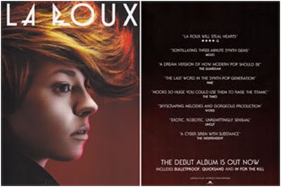
3)La Roux (Debut Album)- This album magazine advertisement covers a double page spread, the left hand side features only a large image of the artist and the artist name large across the top in the iconic font of the artist. This imagery is also used as the front cover of the album so is easily recognisable to the audience. The right hand side of the advertisement is a plain page which continues the background colour scheme. It features 8 quotes about the album from different newspapers and magazines.- The colours on this magazine advert are dominantly red and brown which is in a 'fade' style effect, these colours match the hair colour of the singer so keep it to a quite monochromatic theme. The text is in a white plain colour as is the artist name/album title, this makes the theme come together and lets people know that the texts are connected.-The photograph on this seems quite faded with it's colours as oppose to being striking and bright, however it is still bold as the unique hairstyle and features make the image. The face has a bright red/pink outline along the front edge of it connotating fire, heat and love. This reflects in the 'edgey' music La Roux creates.
- I like the simple format of this piece and how it has a strong sense of a theme in it due to the colours and text.
- I like the simple format of this piece and how it has a strong sense of a theme in it due to the colours and text.


